Working with Dashboards
Administrators and users with the applicable roles associated to their user IDs may access dashboards associated with there roles.
A dashboard combines reports, charts, graphs, and filter controls into an integrated view of workflow trends. Each dashboard displays an overview of workflow information as well as Filter Dashboard Data and links to view detailed reports, some with links that open work items in XTRAC Workbench.
You can set the global view of the dashboard to display metrics for all the operators, or for either the system operators or associate users only. (This option is not available for the Milestones and Open Work Items dashboards.)
Based on your organization's business calendar, rolling summaries show data up to the most current hour of your date range. The Data as of details on the title bar always show you the timestamp of the latest data.
Note: The workflow administrator configures the default business calendar. The business calendar defines which days are working days and non-working days, i.e. Monday through Friday are typically working days, weekends, and holidays are non working days. The administrator may also enter a starting and ending hour of a business day, e.g. 8 am and 4 pm.
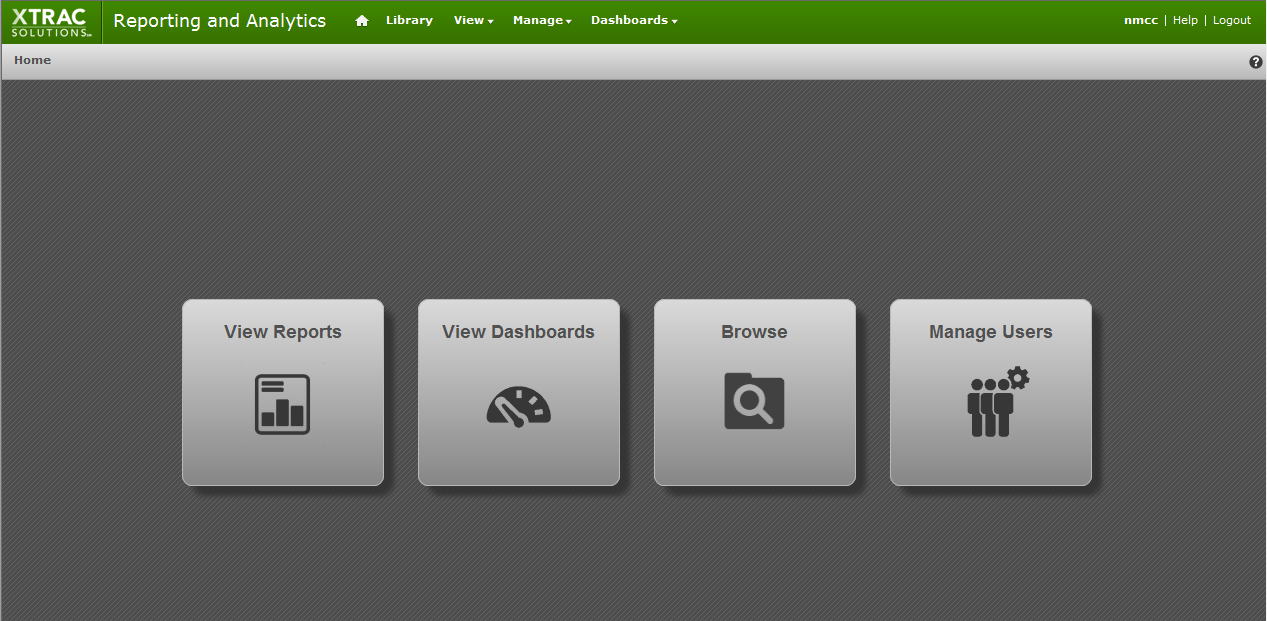
Depending on whether you log on as a user or administrator, you can navigate to the dashboards in different ways. After you log on as a user, the Today's Inventory Activity Dashboard displays as your first page. Logging on as an administrator opens the administrator Home page with icon links to frequently used workflow areas.
You can complete the following tasks from the Dashboards pane:
To learn more about the type of dashboards that you can view from the Dashboards menu list, see Standard Dashboards. Besides the standard dashboards, you may have custom dashboards set up for your specific workflows.
View a Dashboard
| 1. | Either: |
- On XRA menu bar, move the pointer over the Dashboards option and click a dashboard name in the displayed Dashboards list.
or
On the administrator Home page:
- Click the View Dashboards icon. The Library pane (incorrectly labeled "Repository") opens with the Dashboards filter applied and displays the list of available dashboards.
- Click a dashboard name from the table.
The selected dashboard opens. Depending on which dashboard is opened, it may display report charts and graphs by date range, time interval, item type, queue, node, status, age group, name, and operator, as well as summary data.
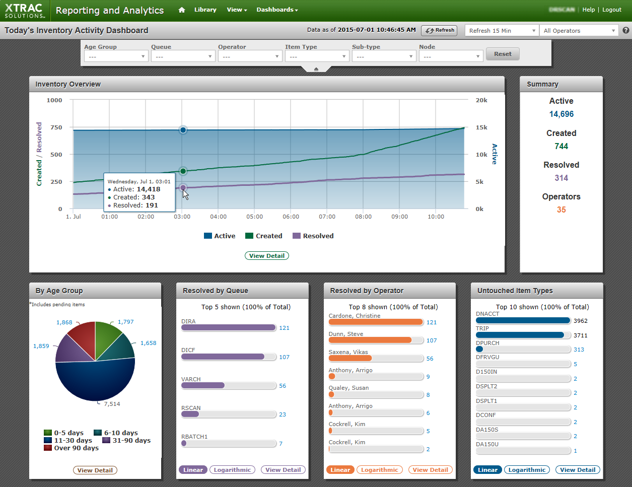
Dashboard example
Dashboard Title Bar
The following information and options may appear in the dashboard title bar.
| Menu | Description |
|---|---|
| Age Group | A range of work items with an age, e.g. the time in days since the creation of a work item. |
| All Operators |
Default option displays all operators
|
| Data as of | Displays the date and time of the last data query. |
| Date Range | A specific time period, i.e. Previous Week. |
| End Date | A selected month, day, and year. |
| Item Type | The type of transaction associated with a work item. |
| No Auto Refresh | The default option in the list box beside the refresh button. However, you can set an automatic refresh rate in this box by selecting a time interval, e.g. Refresh 1 Min. |
| Node | Select a specific node of activity. |
| Operator | User who creates and processes work items and correspondence. |
| Queue | A named list of work items waiting for an operator to process. |
| Refresh | Manually update the dashboard. |
| Start Date | A selected month, day, and year. |
| Time Interval | A specific time period, i.e. By Day. |
| Reset | Restore dashboard to default settings. |
| Status | The state of a work item. |
| Sub-type | A subtype gives additional context to the type of transaction represented by the work item, e.g. a subdivision of item type. |
Dashboard Views
The default view of a dashboard displays metrics for all the operators. To view dashboard metrics for either the system operators or the associate users, in the All Operators list box on the title bar, select the Associate Only or the System Only options.
To view a pop-up box of a graph's value for a time interval, move your pointer along the graph's peaks and troughs.
Below each chart or graph, you can click View Detail, which displays a detailed report in the Report Viewer, filtered by the selected chart's title; for example, Resolved Work Items Detail – By Associate. See Working with Reports. On some dashboards, you can drill down to work items in the reports for specific metrics in summaries and charts. See Drill Down to Work Items.
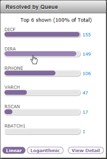
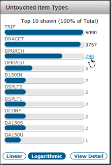
To display a chart's bars as ratios to one another, click Logarithmic below a chart. Alternatively, click Linear to display the bars in proportional values.
On custom charts and graphs, when you move your pointer over them, a Refresh icon ( ) and an Open in new window icon (
 ) display in the top-right corner. You use these buttons to refresh either a chart's data or to open the chart in a new window.
Drill Down to Work Items
These dashboards have reports with links to a metric's related work items:
- Today's Inventory Activity Dashboard
- Resolved Work Items Dashboard
- Created Work Items Dashboard
You can then click a work item number in the report to open that work item in XTRAC Workbench.
To open a drill-down report with work item links from these dashboards, simply click a blue-number link on one of the dashboard charts. Because reports only list a maximum of 2500 records, links only display for numbers up to 2500.
On the Summary pane of the Today's Inventory Activity Dashboard, you can also view a drill-down report by clicking the work item numbers under the Resolved or Created work item headings.
In the report viewer. one of the columns displays a column with linked work items related to the metric you clicked. See Working with Reports.
Filter Dashboard Data
Depending on which dashboard you view, you can select values in the filter fields above a dashboard, reshaping the data in the graphs and charts to suit your analysis. For example, you can change the filter values to segment the data by a date range, item type, sub-type, queue, node, associate, queue, and status.
To filter dashboard data using the filter fields
| 1. | Select new values in any of the filter fields at the top of a dashboard. |
The dashboard automatically displays with the new filter values applied.
| 2. | (Optional) Click Reset; the dashboard reverts to its previous display values. |
Alternatively, to quickly filter dashboard data:
Click the value you want to filter by in the chart.
For example, to filter the dashboard view by a queue, Click one of the queue bars in the Resolved by Queue bar chart.
After you click the value in a chart, the dashboard reloads with the filter applied. The filter value you selected appears in the filter fields above the dashboard.
| 3. | Click a value in another chart to apply an additional filter. |
View Report Details
To display a report of one of the dashboard charts in the report viewer, click View Detail at the bottom of a chart.
You can also click a linked number in a chart to drill down and view a report with work item details related to a specific age group, queue, operator, or item type.
See Working with Reports for further information about reports.
Standard Dashboards Overview
| Dashboard | Description | Viewing and Filtering |
|---|---|---|
| Operator Activity Dashboard |
Displays charts by date range, item type, queue, status, operator, and a summary pane with the number of work item updates, and totals for item types, queues, operators, and statuses. |
You can filter the dashboard data by the date range, time interval, start and end dates, item type, queue, status, and operator.* To view the dashboard metrics for all the operators, or for either the system operators or associate users only, select an option in the All Operators list box on the dashboard's title bar. |
| Created Work Items Dashboard |
Displays charts by date range, item type, queue, operator, and a summary pane with the number of created work items, and totals for item types, queues, and operators. |
You can filter the dashboard data by the date range, time interval, start and end dates, item type, queue, and operator.* In the summary pane and in the charts below the graph, you can click any of the active number-links to view a report with linked work items for that metric. (As a report contains a maximum of 2500 records, active links only appear on the dashboard if the number is 2500 or lower.) You can then view a work item in XTRAC Workbench by clicking its number in the first column of the report. To view the dashboard metrics for all the operators, or for either the system operators or associate users only, select an option in the All Operators list box on the dashboard's title bar. |
| Open Work Items Dashboard | Displays charts by date range, status, age group, queue, and a summary pane with the number of aging work items, and totals for statuses and queues. |
You can filter the dashboard data by the date range, time interval, start and end dates, status, age group, and queue.* |
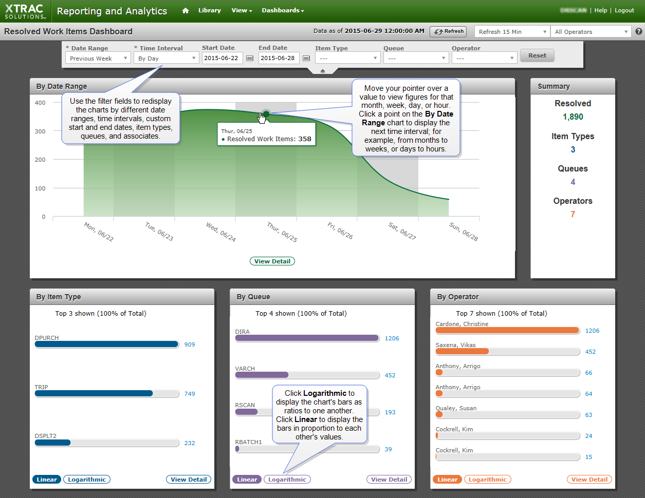
| Resolved Work Items Dashboard | Displays charts by date range, item type, queue, operator, and a summary pane with the number of resolved work items, and totals for item types, queues, and operators. |
You can filter the dashboard data by the date range, time interval, start and end dates, item type, queue, and operator.* In the summary pane and in the charts below the graph, you can click any of the active number-links to view a report with linked work items for that metric. (As a report contains a maximum of 2500 records, active links only appear on the dashboard if the number is 2500 or lower.) You can then view a work item in XTRAC Workbench by clicking its number in the first column of the report. To view the dashboard metrics for all the operators, or for either the system operators or associate users only, select an option in the All Operators list box on the dashboard's title bar. |
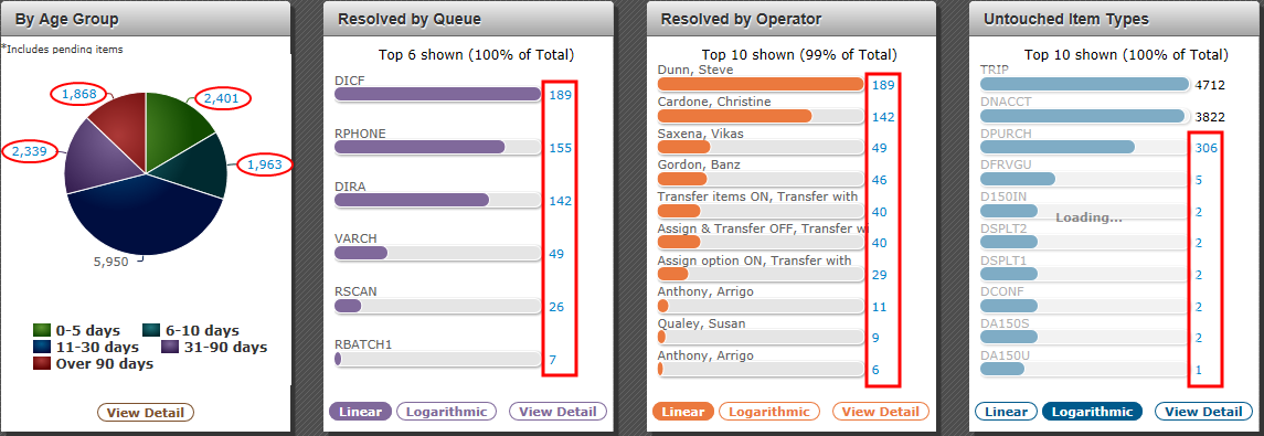
| Today's Inventory Activity Dashboard | Displays a line chart for the inventory overview (Active, Created and Resolved time-lines for work items); a pie chart revealing the total number and percentage of work items by age groups; bar charts showing resolved by queue, resolved by operator, untouched item types; and a summary pane with the number of active work items, totals for created work items, resolved work items, and operators. |
You can filter the dashboard data by age group, queue, operator, item type, sub-type, and node. In the summary pane and in the charts below the graph, you can click any of the active number-links to view a report with linked work items for that metric. (As a report contains a maximum of 2500 records, active links only appear on the dashboard if the number is 2500 or lower.) You can then view a work item in XTRAC Workbench by clicking its number in the first column of the report. To view the dashboard metrics for all the operators, or for either the system operators or associate users only, select an option in the All Operators list box on the dashboard's title bar. |
| All Dashboards | Displays the Library pane with the Dashboards filter applied. |
*In the By Date Range chart on a dashboard, you can quickly redisplay the dashboard at a lower-level time interval by clicking a value point on the graph. For example, if the time interval is By Month, click a value on the chart to redisplay the dashboard pane at the By Day interval. If the time interval is By Day, click a value on the graph line to redisplay the dashboard pane at the By Hour interval.